A Form That Renders Is Not a Tool That Works
Five polished AI-tool pages stayed off production because a real request could not return a usable result.
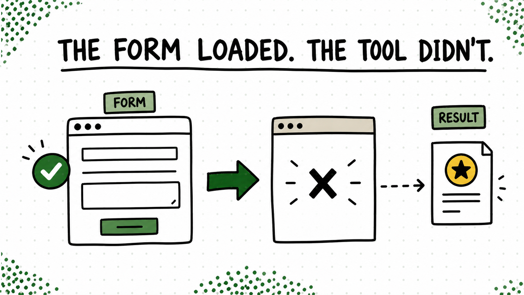
We rebuilt five AI tools on Create & Go. The forms looked right. The fields worked. The pages passed desktop and mobile review. If I had taken a screenshot and stopped there, I could have written a very cheerful update about five tools being “done.”
Then I entered a real prompt. A wildly unfair thing to do to a tool, apparently.
The request reached the provider and came back without a usable result. Later testing isolated the current release blocker to the provider account’s available credits. The interface was not the broken part, but the person using it does not care which layer gets to claim innocence. They clicked a button and did not get the job done.
The screenshot was not the test
A tool is not working because the button changes color when you click it. It works when a normal person can enter something messy, receive a useful answer, understand what happened if it fails, and know what to do next. That means testing the provider, the empty states, the limits, and the error language—not only admiring the form at three screen sizes.
This is the least glamorous part of making a free tool. It is also the part that protects trust. A person will forgive an honest “we could not generate this” message much faster than a spinner that appears to be reconsidering all of its life choices.
Try this on your blog
- Use one realistic input instead of a clean demo phrase.
- Test success, empty input, provider failure, and the usage limit.
- Keep the page private until every path gives the user a clear next step.
You’re done when: A realistic input succeeds, failure states are useful, and the usage limit behaves as promised.
Pretty and broken is still broken. It just photographs better. The finish line is the result in the user’s hands, not the screenshot in mine.