Keep the Working Tool. Fix the Page Around It.
Five working widgets kept their native behavior while the surrounding pages gained examples, limitations, FAQs, and next steps.
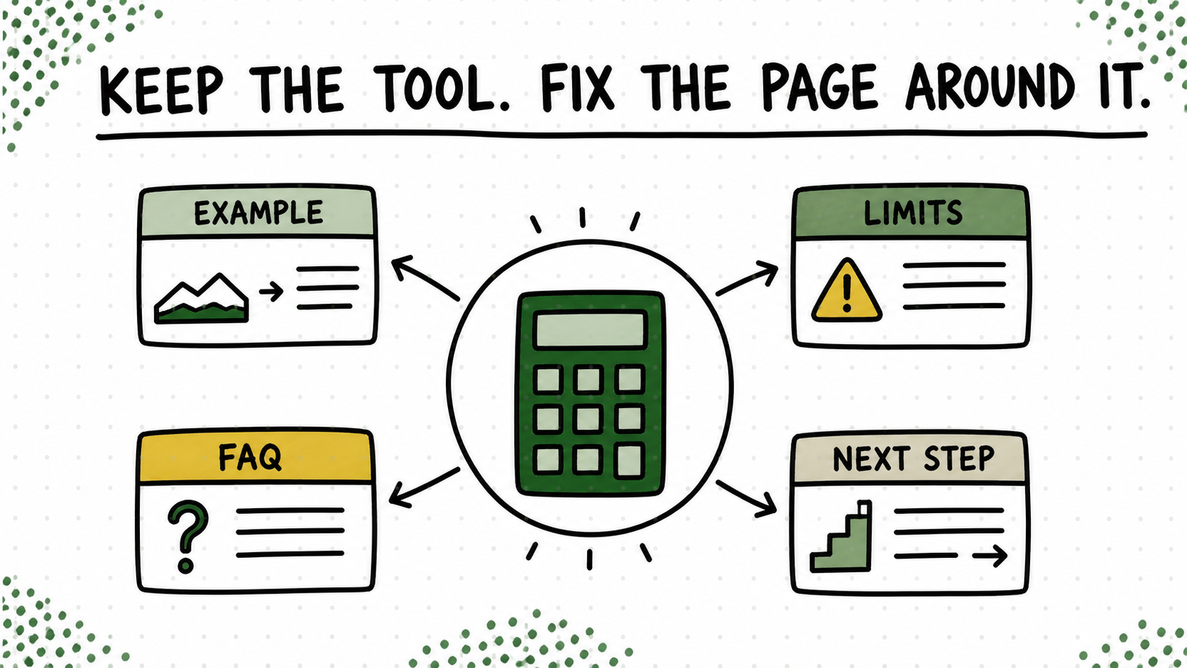
The five Visible Light widgets already produced results. The pages around them were the thin part. A visitor could use the tool, but the explanation, proof, limitations, and next step had not caught up with the working product.
It would have been easy to rebuild everything because “redesign” sounds like permission to touch everything. There is something deeply satisfying about replacing old code with new code, right up until the one thing that worked on Tuesday stops working on Wednesday.
I drew a box around the part that worked
So I drew a boundary around the widget and treated it as an invariant. The editorial shell gained a real example, plain-language controls, honest limitations, a useful FAQ, and one next step after the result. We improved the experience without asking the engine to prove itself all over again.
This does not mean working components are sacred forever. It means change should have a reason. If testing shows the tool itself is confusing or unreliable, fix it. If the gap is explanation, do not create fresh technical risk because the word “redesign” got everybody excited.
Try this on your blog
- Mark the smallest part of the page that already completes the user’s job.
- Freeze that component unless testing proves it needs a change.
- Improve the explanation, proof, and next action around it.
You’re done when: The working component still works, and a first-time user can understand the result, its limit, and the next step.
You do not get extra points for breaking the engine while repainting the car. Protect the part completing the job, and spend the redesign energy where the user is actually getting lost.