One Homepage. One Paid Outcome.
Avocadu’s homepage made the 21-Day Fat Loss Challenge the obvious paid next step instead of presenting every offer equally.
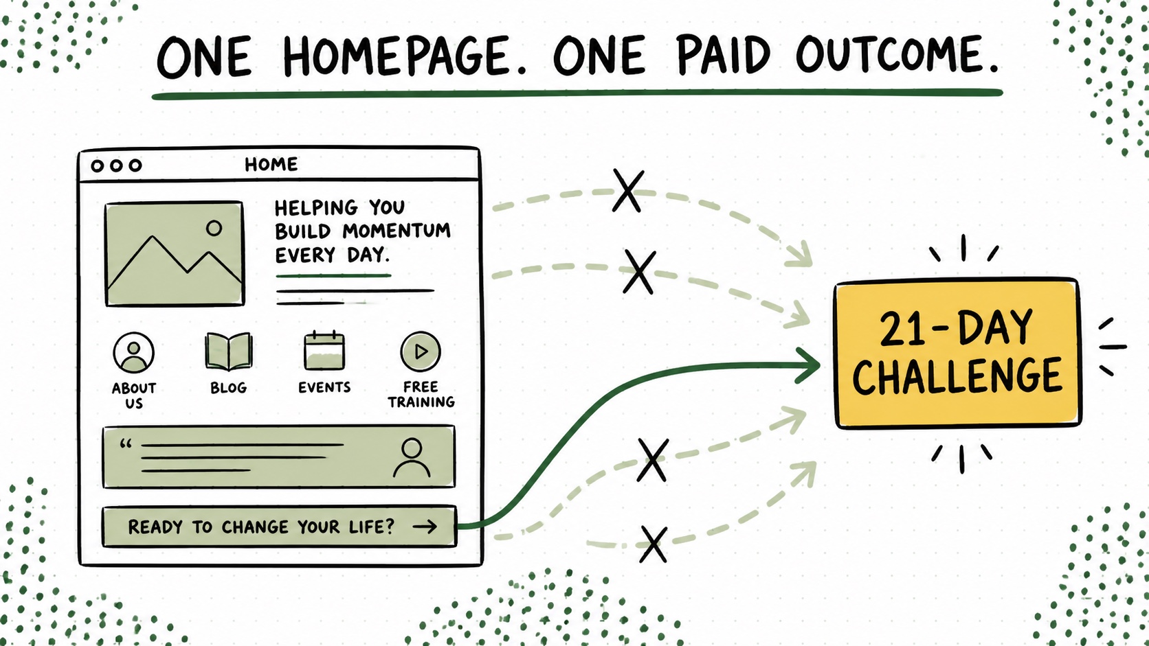
Avocadu had recipes, workouts, guides, and enough useful content to turn the homepage into a buffet. We could have given every category its own headline, button, promise, and tiny claim to fame. We did not.
The June 2021 homepage led with one promise—helping women lose weight quickly, safely, and consistently—and one paid next step: the 21-Day Fat Loss Challenge. The free content was still there. It simply knew which direction it was helping the reader travel.
The boring answer was one offer
The boring answer was one offer. The free content built trust, answered smaller questions, and helped people get early wins. The homepage pointed that trust toward the clearest transformation the business could sell.
I think a lot of sites reverse this. They give six offers equal visual importance because choosing one feels scary. If everything gets a giant button, no product has technically lost the argument. Unfortunately, the visitor now has to hold the argument for you.
Choosing one front door does not mean deleting every other path. It means deciding which transformation deserves the clearest invitation and letting the rest of the site support, segment, or follow that decision.
Try this on your blog
- Name the transformation your best offer completes.
- Make that the homepage’s primary promise.
- Turn every other offer into support or a secondary path.
You’re done when: A first-time visitor can point to the one paid result your homepage wants them to choose.
Your homepage can contain many doors. It should still have one front door—the one you would point to if a good-fit reader stopped you and asked, “Okay, what should I do next?”