Don’t Add the Homepage Button Until the Next Page Exists
The relaunch stopped treating an unfinished offer or quiz as a valid homepage destination.
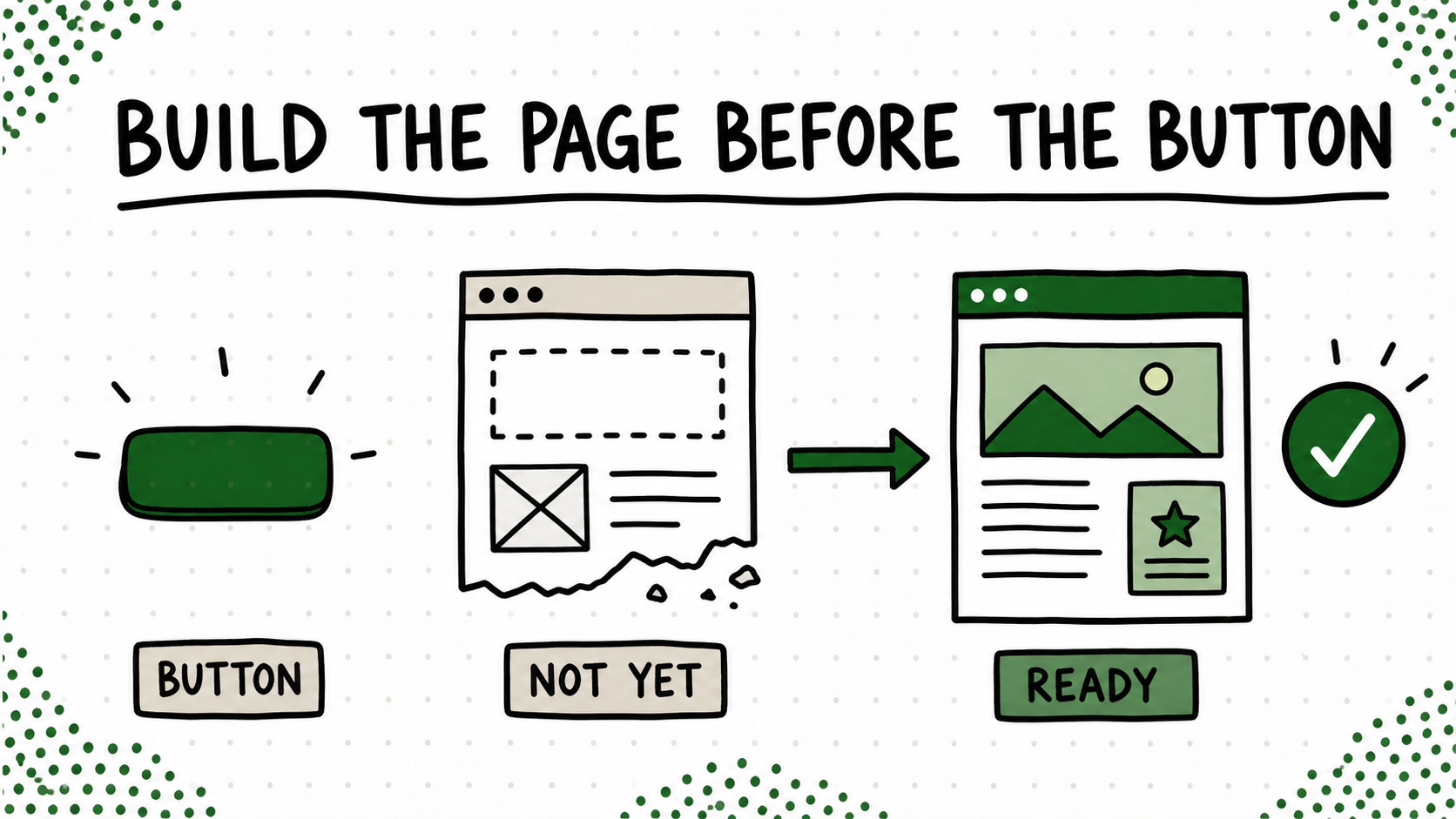
I used to treat adding the button as progress. New course idea? Add a button. Quiz coming soon? Add a button. Product page halfway done? Sure, give that thing a button too. Nothing says “we have a strategy” quite like six attractive ways to reach pages that cannot help you yet.
That made the homepage look finished while the journey behind it was held together with “coming soon” pages and good intentions. From my side, I saw the roadmap. A first-time visitor only saw the dead end.
Now the destination has to earn the button
Now I start at the other end. I open the destination and try to complete the job as if I know nothing about the project. Can I understand the offer, finish the quiz, get the resource, or buy the product without needing the context that exists only in my head? Does the confirmation work? Is the next step real?
If the answer is no, the homepage does not link to it yet. This feels slower because there is less visible decoration at the beginning. In practice, it is faster because I am finishing one path instead of opening five loops and pretending the loops are a funnel.
Try this on your blog
- Click every homepage button as a first-time visitor.
- Write down the job the destination is supposed to complete.
- Remove or hide the button until that job works from beginning to end.
You’re done when: Every public homepage button leads to a complete, usable destination.
A missing button is honest. A polished button leading into drywall is not. Build the room, turn on the lights, make sure the door opens, and then hang the sign.