The Homepage Test I Use Before Adding Another Button
Every promise on the new homepage had to lead to a useful next step—or lose its button.
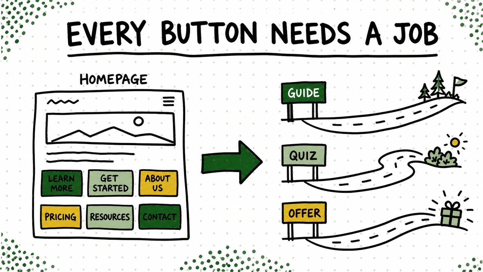
Every time I opened the Create & Go homepage, I found one more thing it apparently needed to explain. The courses. The story. The system. Why blogging still matters. What someone should do first. What they should do after that. At one point the homepage was basically trying to give the entire campus tour before a visitor had even parked the car.
The problem was not that any one section was terrible. The problem was that every new explanation created another button, and half of those buttons led somewhere vague. I was making the homepage look busier without making the next decision any easier.
The four-column test that finally fixed it
So I opened a plain note and made four columns: visitor situation, promise, next page, job completed. It was not fancy. No 47-tab funnel map. Just four mildly annoying questions that forced me to be honest.
If I could not fill in all four columns, the button did not belong on the homepage yet. “Get started” was not a destination. A guide, quiz result, tool, case study, or offer that finished the thought was.
This made the homepage shorter, but that was almost a side effect. The useful part was seeing which destinations did not exist yet. The homepage was not failing because it needed prettier buttons. It was exposing holes in the journey behind those buttons.
Try this on your blog
- List the three or four situations people arrive in.
- Give each situation one useful next page.
- Delete any button whose destination does not complete a specific job.
You’re done when: Every homepage button now has one audience, one destination, and one job.
I still want the homepage to tell a story. I just do not need it to tell every story. Its job is to help the right person recognize where they are and take one useful next step without needing a compass, a webinar, and a small emotional-support animal.