Your blog is the heart and soul of your online presence. It’s a place where you can share stories, tips, advice, experiences, and more with your audience.
But in order for it to be successful and engaging, you need to have a strong blog design that entices readers to keep coming back for more.
One of the best ways to find great blog designs is simply to look at the blog layout of other successful blogs.
From sleek minimalist designs to vibrant interactive layouts, each example has something that makes it stand out from the rest – proving just how creative and unique blog designs can be!
Whether you’re looking for some fresh ideas or just want to get an idea of what works best on the web today, these blog design examples are sure to give you plenty of inspiration.
We’ll highlight some of the most important elements of your layout and design and well as some of the common themes we see in the blogs featured in this article
Let’s look at some great blog design examples and some common characteristics that make up a good blog layout.
Important Elements of a Good Blog Layout
“Design is not just what it looks like and feels like. Design is how it works.” — Steve Jobs
This quote is really fitting because we tend to associate design with appearance rather than functionality, but if you want a successful blog, it’s vital to have both.
Your blog design should have a clear plan and purpose.
Let’s talk about the basic elements of blog design and layouts.
1. Customizable Blogging Platform
A customizable blog platform is essential for creating a blog that looks great while also delivering optimal performance for your readers.
If you want to create a successful blog, the best and most widely used blogging platform is WordPress. It provides access to the widest amount of plugins and additional customizations to help you design your blog, get more traffic, and make more money.
2. Responsive Design
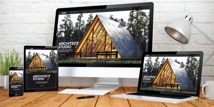
Responsive design is an approach to web design that allows your blog’s layout and content to adjust for optimal viewing on any device or screen size (mobile, iPad, desktop, etc.).
Most good WordPress themes come with a responsive design. Make sure to choose a blog theme that is beginner-friendly and customizable.
You should also design your blog with mobile users in mind because most blog traffic tends to come from mobile devices. Make sure your blog looks great on all devices by utilizing a responsive design.
3. User-Friendly Navigation

Your blog should always be easy to navigate, and that starts out with your navigation bar and menus.
It should be as easy as possible for readers to find the information they’re looking for.
Your main menu should include links to your most important content and resources, including (but not limited to): your blog, about page, email opt-in, products, etc.
Your menu should also be easy to navigate across all devices, so make sure to check it on mobile too.
Consider how to best utilize the space on your main navigation menu, footer navigation menu, and secondary menu (optional).
4. Brand Colors
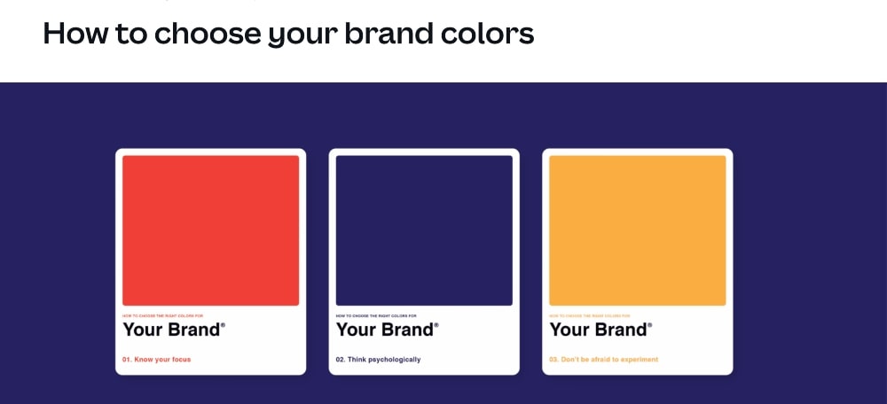
Good blog designs need to be easy on the eyes and visually appealing. Having a strong color palette that complements your branding will help ensure a consistent look and feel.
Using the wrong colors can make your blog look tacky or unprofessional. You also don’t want to have too many colors, because it will make your blog design look cluttered.
When deciding what colors to use, it’s important to consider how they will blend with the overall aesthetic of your website.
For example, if you have an outdoor-themed blog, using shades of green and blue may be a better choice than red or orange.
Using contrasting colors can also help draw attention to specific elements and make your blog design more visually appealing.
5. Quality Images
High-quality images are another essential component for any successful blog design. They should not only add aesthetic value but also help tell a story and tie together your blog posts. They make your blog more interesting and less like a textbook that you never want to open.
When selecting images for your blog, use stock photos that are relevant to the content being discussed.
Avoid using generic or clichéd images that have been seen too many times before or photos that look overall too… “stock-y.”

Finally, pay attention to the image size and ratio, as well as cropping techniques so they will look great across all devices.
Related: Best Free Stock Photo Sites for Your Blog
6. Consistency
No matter what blog design and layout you decide to go with, make sure to remain consistent across your website and even on social media.
Sticking to the same design principles will ensure a consistent experience for readers and help them recognize you when you share your blog content across other platforms.
Other Blog Design Elements to Consider
Let’s go a little deeper and talk about some other important blog design elements you should consider when it comes to your content.
7. Fonts, Colors, and Readability
It should go without being said, but your font choices and colors play a very important role in how people interact with your content.
If your words are too close together, the wall of text on your blog can feel too intense for the average reader.
Most people are skimmers, so they want plenty of space to quickly glance at what’s important.
Your main body font should be easy to read on any device, size, and resolution. You can use a combination of serif and sans-serif fonts for headings, titles, and other elements on the page.
Your headings should be large enough to stand out against your body content and easily scannable so that readers can find what they are looking for on your page.
Make sure your main text size is large enough to be read and that your paragraphs and headings use appropriate line spacing.
8. Quick Page Speed and Loading Times
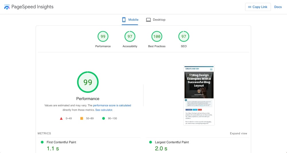
People have increasingly shorter attention spans and are less likely to wait for a page to load or spend too much time figuring out how something works.
This is being made even worse by platforms like Instagram and TikTok that push content in 10-15 second time spans.
Having quick page speed is absolutely essential for a better user experience on your pages as well as for SEO. Search engines favor faster-loading sites.
Make sure to use a theme that doesn’t slow down your website too much, optimize all of your images before uploading them, and use plugins to enhance your performance.
Related: Best WordPress Plugins for Blogs
7. Search engine optimization (SEO)
Speaking of SEO, it’s important to optimize your blog posts for better search engine visibility.
Make sure to write great blog titles, use relevant headings and keywords throughout the body of your content, and link to other pages on your website as well as great resources to other websites.
In addition, make sure that all images have alt text so search engines can understand them better.
Make sure you at least understand the basics of SEO and consider using advanced SEO tools to help you write better content.
Related: How to Rank Your Blog Posts in Search
4. Social Media Integration

Include social sharing buttons as well as widgets that show off recent posts from social networks.
Integrating your blog with your social media channels and other content platforms is an easy way to get more visitors and increase engagement.
You can also use plugins that allow readers to comment on posts via their social media accounts or even create polls and surveys right in blog posts.
In the very least, make sure that your social media icons are visibly linked somewhere on every page (ideally in your header or footer).
6. Clear Calls-to-Action (CTAs)
Your blog design should always include calls-to-action (CTAs) where appropriate so readers can easily take the next step.
That next step can be anything from reading more blog posts, subscribing to a newsletter, following you on social media, or buying a product.
If you want your readers to check out your featured articles, make sure to include them on your blog homepage where they can easily be seen.
Include CTAs on your homepage as well as on all of your blog posts.
17 Blog Design Examples and Ideas for Inspiration
Now that we’ve touched on the basics of blog design, let’s look at how these blog design guidelines can be implemented with some real-life examples!
These blog design examples are in various niches. If you want some additional or more specific inspiration, check out these related posts:
1. I Am Baker
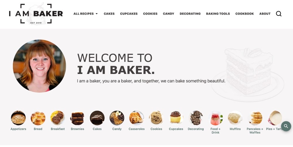
I Am Baker’s blog design stands out because it’s very simple. The colors are mostly white and neutral colors, which brings the focus to her beautiful photos.
Her navigation menu contains the different categories of her blog, which makes it very easy to navigate, and there is also a very consistent design across her website.
2. Brit + Co
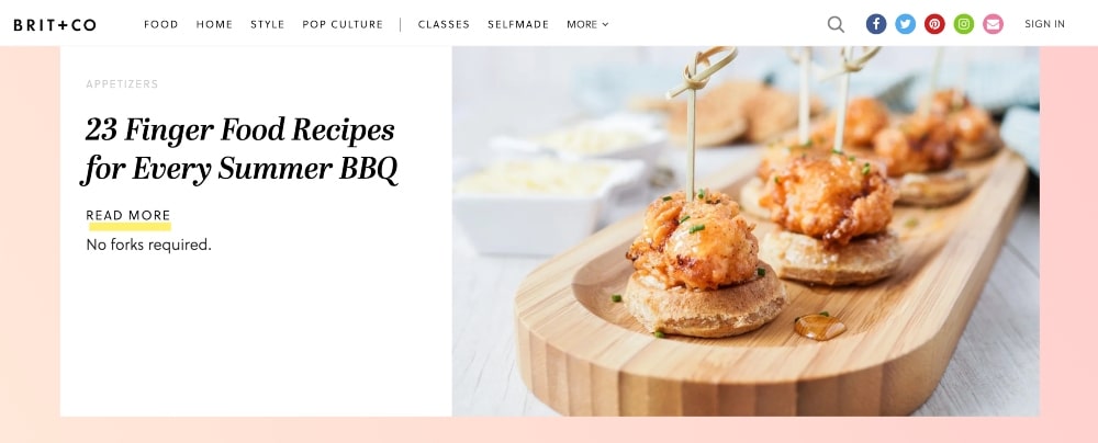
What’s great about the blog design of Brit + Co is that the homepage features one large, high-quality image with one post link.
As soon as you hit the website, you are greeted with a featured article that captures your attention and makes you want to click to read more.
The homepage features a lot of popular blog posts with bright, engaging photos.
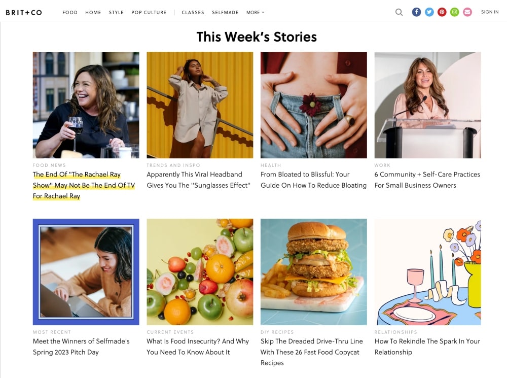
This blog also provides multiple ways to sign up for the newsletter.
3. YTravel Blog
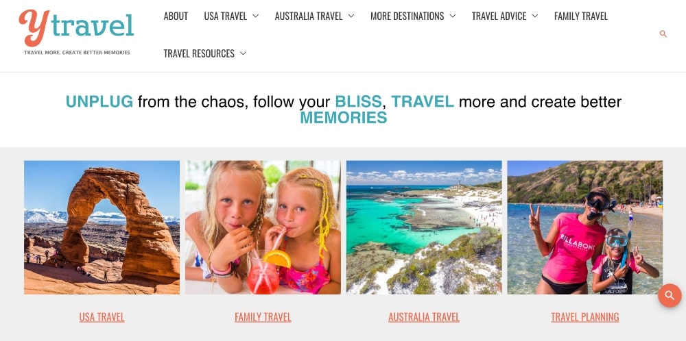
I swear travel blogs have it easiest because they can use real-life, amazing photos and skip the whole search for stock photos.
YTravel Blog is no exception, with their blog’s homepage featuring their popular blog categories along with real-life photos of travel and family.
There are also several other personal photos of the family on the rest of the homepage.
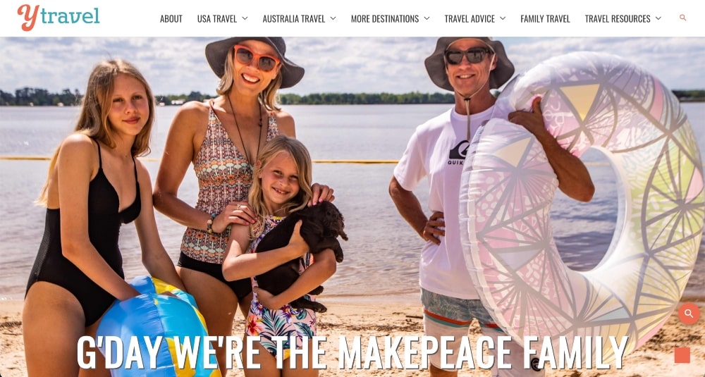
This blog design helps to create a personal connection with their audience.
4. Clever Girl Finance
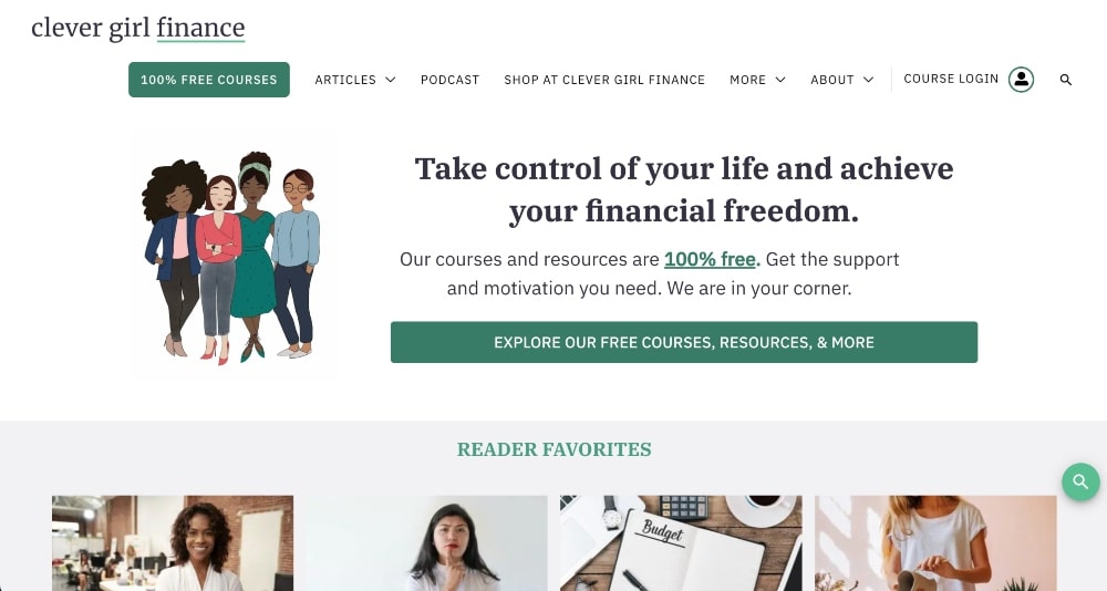
Clever Girl Finance is a great example of a really well-designed blog that caters well to her audience.
She has a header image with an email sign-up form that prioritizes her email list and offers her visitors a great, free resource when they land on her website.
She also uses a search bar widget on her website to make it very easy to navigate.
Lastly, she has a simple color scheme and an overall professional and beautiful blog design.
5. Ape to Gentlemen
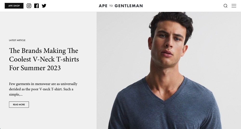
Ape to Gentlemen is a popular men’s fashion and lifestyle blog.
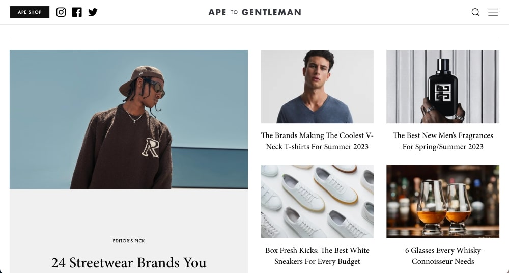
The homepage features a grid format of its latest articles.
When you head on over to the blog, you can see that the articles use a lot of white space, which draws your attention to the content.
It’s a simplistic blog design and it really works for this blog and it’s audience, which is men.
Keep your target audience in mind when you design your blog.
6. Another Escape
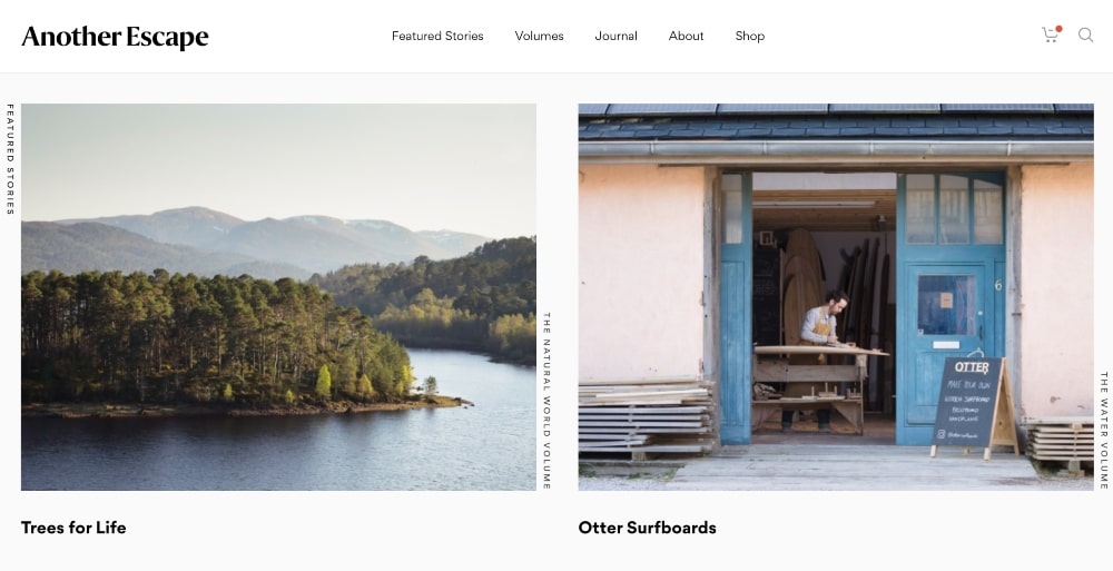
Another Escape is an outdoor lifestyle and photography blog that encourages readers to connect more with the natural world and become active stewards for our planet.
The custom images for each blog post are what really stand out in this blog.
They have a very simple but creative blog design that really highlights the mission of this website.
7. Helene In Between
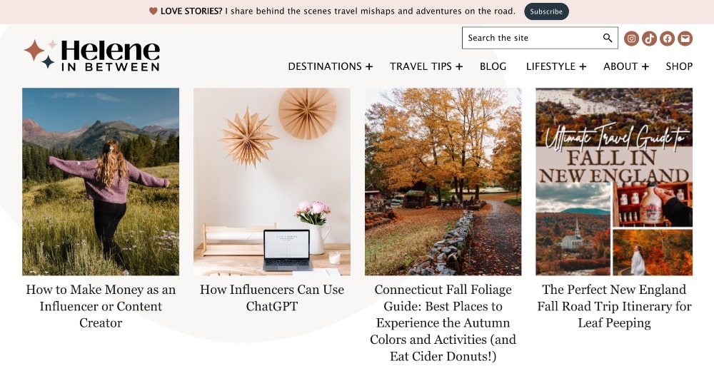
Helene In Between is a lifestyle and travel blog with a great blog design across the entire website.
You can see her brand consistency even in every featured image because she uses filters on her photos to make them match the colors of the blog better.
Her blog features a lot of valuable content about photography, traveling, social media, dogs, money, fashion, and more.
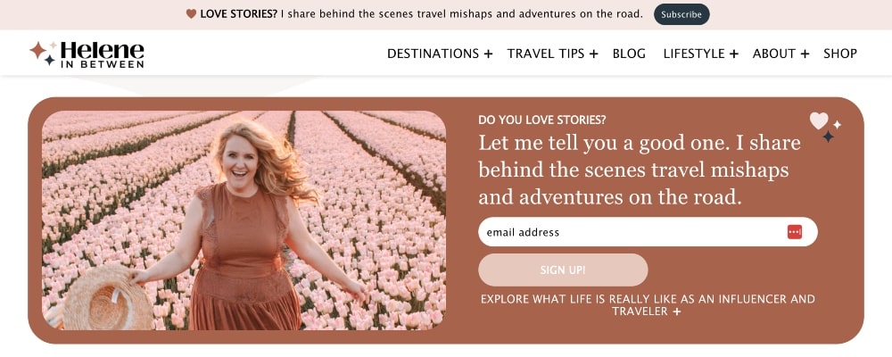
She has a call-to-action for her email above her navigation bar and later on down her homepage, which is a great way to prioritize her email list.
Finally, the homepage features a lit of her latest posts.
8. Smart Passive Income
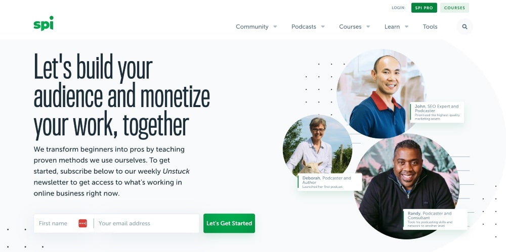
Smart Passive Income is a very successful business blog started by Pat Flynn.
What makes this blog’s design unique is that when you land on his homepage, he features his customers front and center.
Most bloggers tend to feature themselves or their blog content first. Pat puts his readers and clients first, which we think is a great design inspiration for anyone who wants to connect better with their audience.
Pat sells a lot of online courses, so it’s also a great way to advertise the results he has helped clients get.

9. P.S. I Made This
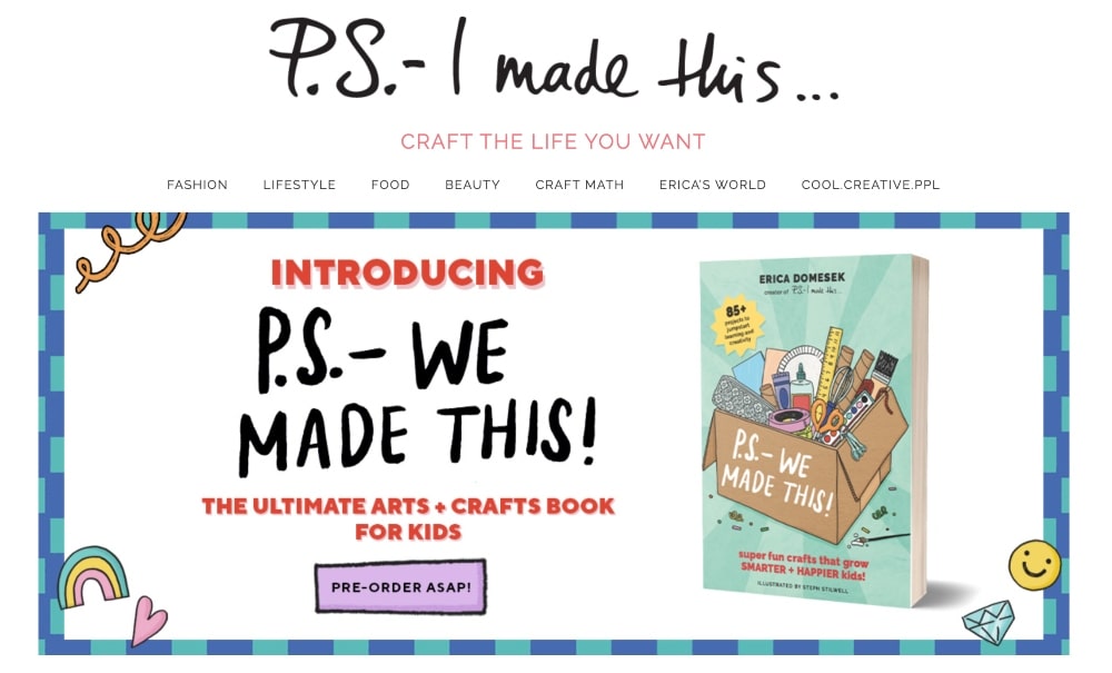
This next blog design example is another lifestyle blog called P.S. I Made This.
The website features a carousel that switches between a new product and a featured image for a popular blog post.
Featuring your popular products first and foremost as a part of your blog design can turn some people off but it can also be done very tastefully and can lead to more sales.
It also features a lot of the latest content from the blog, YouTube Channel, and Instagram, which is a great way to bring attention to a variety of social media channels.
10. Style by Emily Henderson
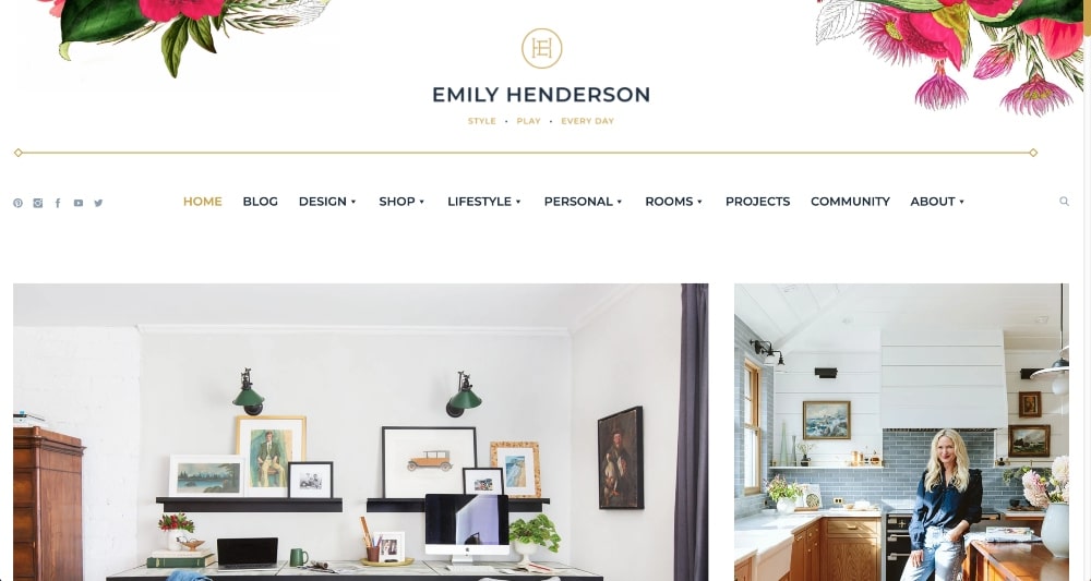
Style by Emily Henderson is a lifestyle and interior design blog with a homepage set up like a blog page that features all of her latest posts.
She uses a lot of her own photos and works with some talented designers to bring great content to her readers.
She only uses one accent color on her blog as well as big, bold font for her headings, which brings your attention straight to her content.
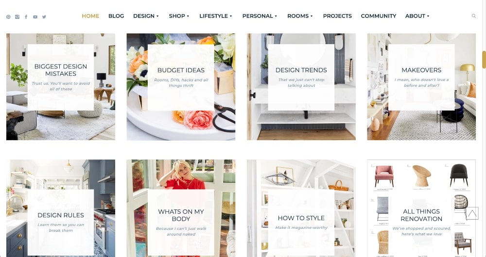
It’s a simple and professional blog design that can work for a blog in any niche.
11. Fitnancials
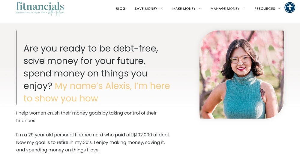
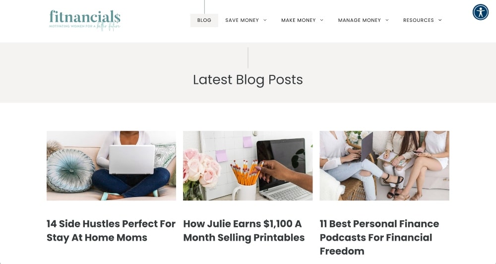
Fitnancials is a finance blog started by Alexis. We wanted to feature her on this list of best blog design examples because of the header image on her blog.
Many bloggers choose to include a photo of themselves as their featured image or header to connect better with their audience.
This works well for a variety of different blogs and can help to establish yourself as an authority figure.
12. Natalie Bacon
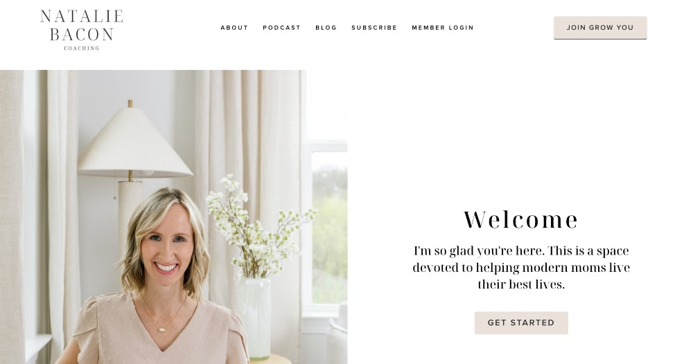
Natalie Bacon has a blog design inspiration that screams minimalist professional and we love it.
She uses a very basic color scheme and a lot of white, empty space on her blog.
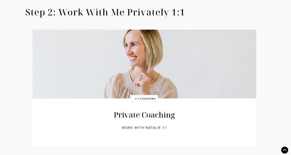
Natalie’s blog design draws attention to her content, like a lot of the other blog design examples on this list.
Some blogs get a little crazy with the colors and different directions you can take on a website.
When you keep it simple and prioritize what’s important, you encourage visitors to take the most important steps that you want them to take.
13. The Savvy Couple
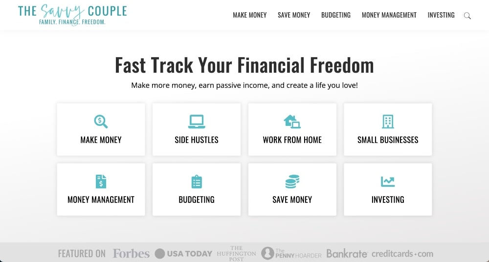
The blog design for The Savvy Couple is unique because it features more graphic design than actual images in the header area of the website.
They also have a clear call-to-action to sign up for their email list, which we think is a really important aspect that most of the blog design examples on this list have.
Finally, they feature their latest and most popular blog posts on their homepage.
14. Studio DIY
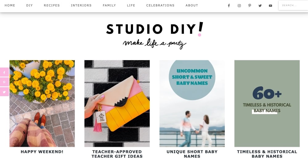
Studio DIY is one of the best blog designs for most new blogs starting out.
Many new bloggers get hung up on trying to get the perfect header image or some fancy, intricate blog design for their homepage.
But really all you need is a blog page to get started that showcases your content.
Studio DIY is an established blog, but its homepage is simply a collage of different blog categories and posts.
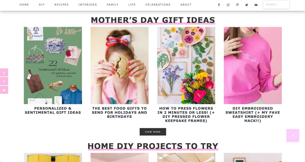
It’s simple and easy to set up and a great starting point (or ending point) for any type of blog.
15. Pickle Bums
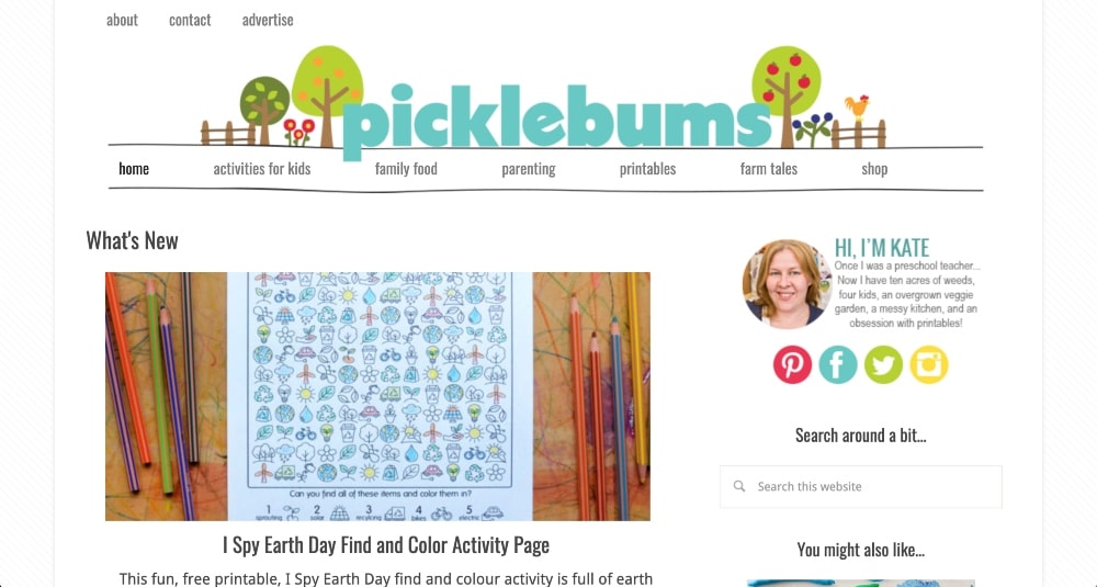
The parenting blog, Pickle Bums, has a more traditional blog design.
The blog’s homepage shows the latest blog post, a picture of the author (blogger), social icons, and a lot of links to other blog posts.
This is another perfect blog design that is ideal for beginners and can be created with just a few blog posts written.
16. Girl Gone Abroad
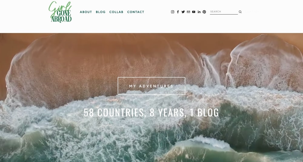
Girl Gone Abroad is a travel blog by Lauren Carey.
Her blog design features a background video as well as her latest posts and an email sign-up section.
Lauren takes all of her own photos and uses unique filters on them to make them stand out.
As readers scroll through her blog, they can’t help but want to take the trips that she features on her blog.
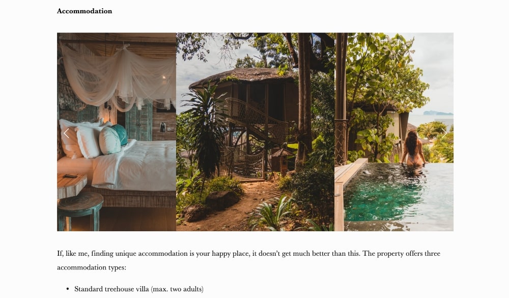
She gives advice on where to go, where to stay, and what to do while you’re there.
Her creative blog design helps her blog stand out against other travel blogs.
17. Breaking Muscle
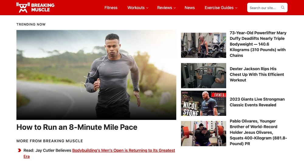
The blog design for the fitness blog, Breaking Muscle, is set up to look more like a news outlet.
They showcase their trending articles, recent articles, and most popular articles on their homepage.
If you have a blog in the tech space or any other space that delivers trending content, this is also a really great blog design to consider.
You can showcase the latest tech news, sustainability news, health news, etc.
The design is very simple and only uses branding colors of red and black.
FAQs About Blog Design and Layouts
Key Takeaways for Successful Blog Design
Blog design is a very important part of creating a successful blog. It requires careful consideration and planning, as well as finding the right balance between aesthetics and user experience.
Your homepage is essentially a landing page where your readers find out more about you and what you do.
Keep the reader’s experience in mind when you design your blog. Here are some of the key takeaways we discussed in this article:
- Customizable blogging platform
- Responsive blog design
- User-friendly navigation
- Brand colors and quality images
- Clear fonts, colors, and readability
- Page speed and performance
- SEO and social media
- Clear calls-to-action
Some of the most popular elements that we saw on these blog design examples include:
- Latest featured article
- Latest blog posts
- Blog categories
- Header image with your photo
- Simple colors
- Email sign-up form on the homepage
By following these elements of a good blog layout, you can be sure that your blog will stand out from the rest and encourage readers to take action where you want them to.
Remember – there’s no one-size-fits-all solution when it comes to blog design, so keep experimenting until you find something that works best for you and your audience!
Your blog design will change over time and it should! It helps to keep it interesting for both you and your audience.
We hope that this article helped you find a design idea or two. If you have any questions, leave them in the comments below!
Comments
24 responses to “17 Blog Design Examples With a Successful Blog Layout”
Great Article🔥
Learner a lot through your website.
Thanks! ❤️❤️
You are so welcome!
I recently decided to start a blog and I am currently trying to design it. you guys have been a big help and inspiration. right now I am using the 2020 WordPress free theme but hopefully will upgrade it to a paid theme after a few months.
I really love the theme design of avocado and would really appreciate it if you could tell me how I can get a navigational horizontal menu like the one in avocadu that is visible on mobile devices.
Hey Thomas, both Avocadu and Create and Go are fully custom coded. Our web designer coded the menus to look like that on mobile.
Hello ma’am I too just started a blog and I need help customizing it , can you teach me , pretty pretty please?.
We teach a few design skills in our paid beginner course, but it’s not the primary focus. You can also search for YouTube videos that are specific to the theme you chose for your blog.
Hey, I’m a novice in blogging, where can I get good quality stock photos which won’t cause any copyright issues? Confused with that a bit (some of the blogs aren’t clear about that)
Here are several sites where you can download images without copyright issues.
PXhere
Flickr
Freepik
Pixabay (our favorite free options)
Unsplash
Pexels
Hi! I’m starting my blog and I’m doing tons of research before J publish and what not so your blog and youthbe videos are awesome! For affilare links, I have a list of some that are likely to accept a newbie but I’m confused on if I have wordpress, would all the affiliate links go through that or you sign up for all of then individually. Do they pay you through word press or through that company. I hope this makes sense.
Affiliate programs are not part of WordPress, which is your blogging platform. You would link to affiliate products within your post. Most affiliate programs pay via Direct Deposit for PayPal. That would be set up once you are accepted into the affiliate program.
sir i have a question please give me some important sugestions .. i have a website but the issue isn that my whole traffic is from socila means from fb about 80 percent.. but i have heard that traffic from social can cause to ban your adsence .. please guide me… i am waiting
Traffic from social media platforms should have no impact on your standing with AdSense. Depending on your niche, the bulk of your traffic will come from social media.
Hi Alex and Lauren! Just wanted to say thanks so much for all your amazing content. I’ve bought all of your courses (separately ha! Because I had a lot of doubt of how useful they would be—then they all blew me away!! Honestly, definitely the most straightforward and useful courses I’ve done!)
My question is– have you guys ever had issues with page speed and Divi? My website is super slow and when I analyzed it in PageSpeed Insights it said— Themes, plugins, and server specifications all contribute to server response time. Consider finding a more optimized theme, carefully selecting an optimization plugin, and/or upgrading your server.
The more customizations you make with your theme, the slower it will be. This is true for all themes, especially those that implement a page builder. I’d stick with your current theme and then switch later down the line when you can afford a designer. Hope this helps!
Hey Lauren, we are having non stop problems with Divi theme also, do you have any suggestion for a great developer?
We recommend Grayson Bell with iMark Interactive for assistance with your technical issues.
hi there! where do you recommend in a logo design? I just want a text logo. Thanks!!
Hey, Theresa!
iPiccy is a good place to design a logo. Just go to https://ipiccy.com/ and go to the “Create a Design” area. You’ll want to create an image with a transparent background so it can be used on any color background.
–Lauren
Lots of great tips! Thanks for sharing!
It is really a great post. Very informative and helpful.
Thanks, Sonika!
Great Post! It is very informative.
I have been designing my blog in Wordpress.org, but I really need support: someone I can text or call who can walk me through it. Do you have any recommendations? I’ll be glad to pay for the assistance.
Hey Robin. We teach more about how to navigate WordPress and design your blog in our Launch Your Blog Course, which can be found on the Courses page of our website.
It also comes with access to a private support group where we provide additional assistance, which you can also get from other group members as well.